Appreciating stripe paintings took me somewhere around twenty years. The first one I really looked at was a long Gene Davis painting a friend had hanging in his loft. The other pieces in his space drew me in more naturally: a Warhol portrait, an enormous Chihuly float, a ponderous Howard Ben Tré, some Voulkos pieces, and a large painting by David Bates. I thought the Davis painting, though, was boring as hell: flat and pointless. No brushwork. No gesture. No life.
I bumped into the name Daniel Buren a few years later and fell in love with the sort of absurd stoicism of his work: alternating vertical stripes against a ground of white, each methodically the same width, somewhere between being too fat and too thin. Buren’s stripes had confidence, even arrogance in their simplicity. He didn’t seem to try to make them interesting, yet their ordinary predictability got to me. I found something profoundly appealing about Buren’s extreme back-to-basics approach. I still do. Even the widths of his stripes. They never seem to deviate.
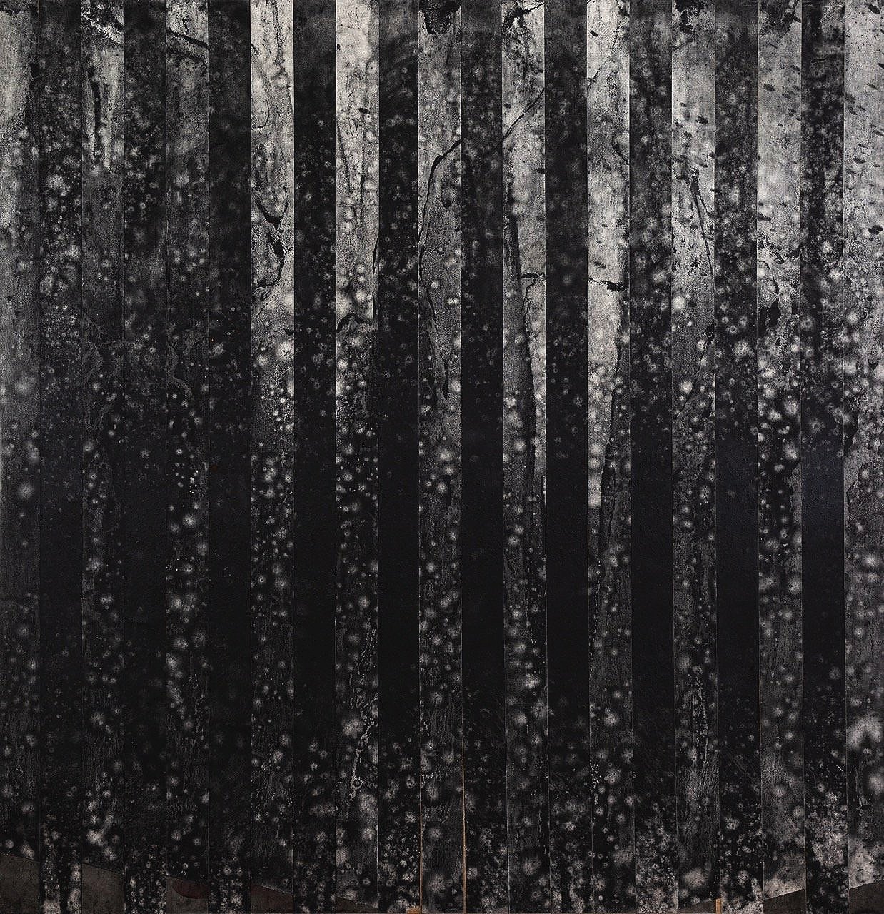
Nigh Skies / Number 1 (2023)
graphite on paper
64 x 66 inches
© iv whitman 2023
As more time went by, the stripe work of Noland, Martin, Riley, and Bleckner’s from the 80s, even Richter became some of my favorite people to spend time with. Especially Martin and Blecker. I loved the monk-like marks of Agnes Martin and the glowing quality of Ross Bleckner’s brushwork, which one rarely sees in more minimal paintings. Both Martin and Bleckner gave life to their stripes.
At the same time, I was drawn to the gestural paintings of Motherwell’s Elegy to the Spanish Republic series. More specifically, it was the splashy fringes of the dominant shapes that drew me in. These were small details, but wide open and free. Lots of the Abstract Expressionists approached the paint like this: Pollack, Kline, Frankenthaler, and so on. But it was Motherwell who appealed to me. I liked his sloppiness.
My gestural stripe work is a bit of an homage to these artists. For me, though, the stripe represents an effort to control the wild contortions of nature. Locked inside each of their edges is a world of chaos, each with its own swirling and splattered ecosystem alternating one stripe to the next, and sliced with a blade or taped off with an edge.
The Night Skies series is a combination of all the simple elements I love: a gesture of black graphite on top of a white ground with the cleanliness of a stripe. As much as I attempt to control my life, whether it’s managing my time or attempting to steer a conversation, my attempt at doing so is just that: an attempt. And a failed one at that. That’s the stripe. And inside of each stripe lives that chaos I arm wrestle into submission. Again, a failure. The Night Skies are metaphors of failure, but beautiful failures at the same time. Another metaphor. We can find beauty in our push to shape our reality, as well as beauty in how reality shapes us.